
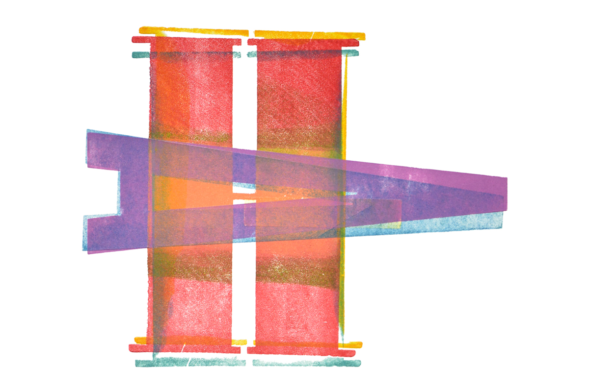
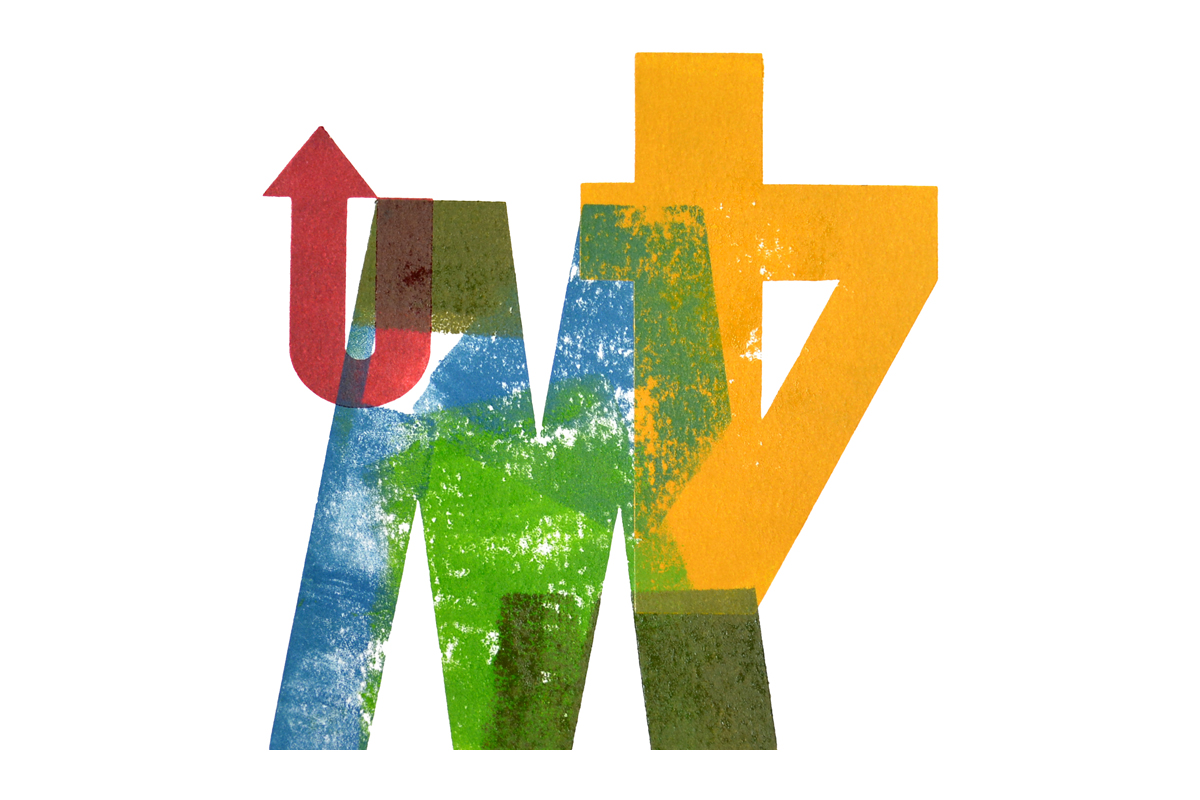


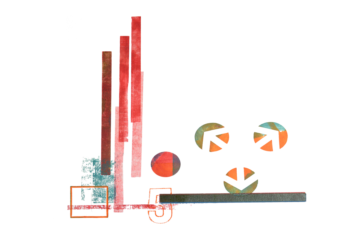
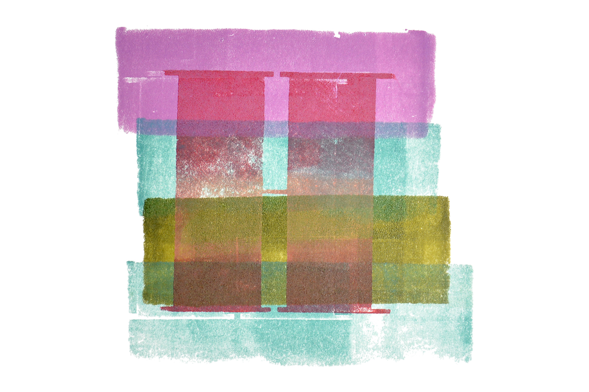
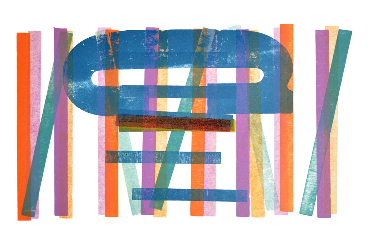
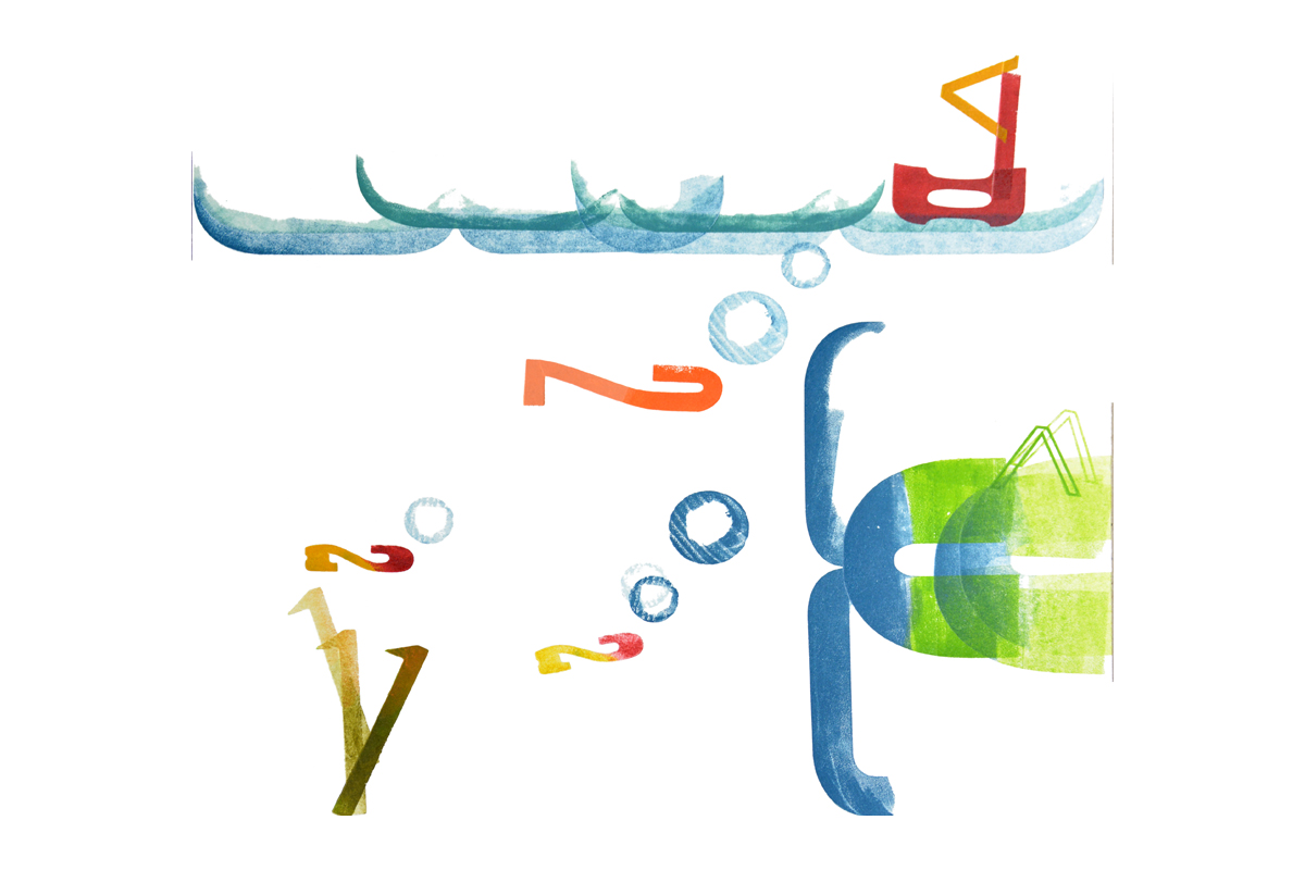
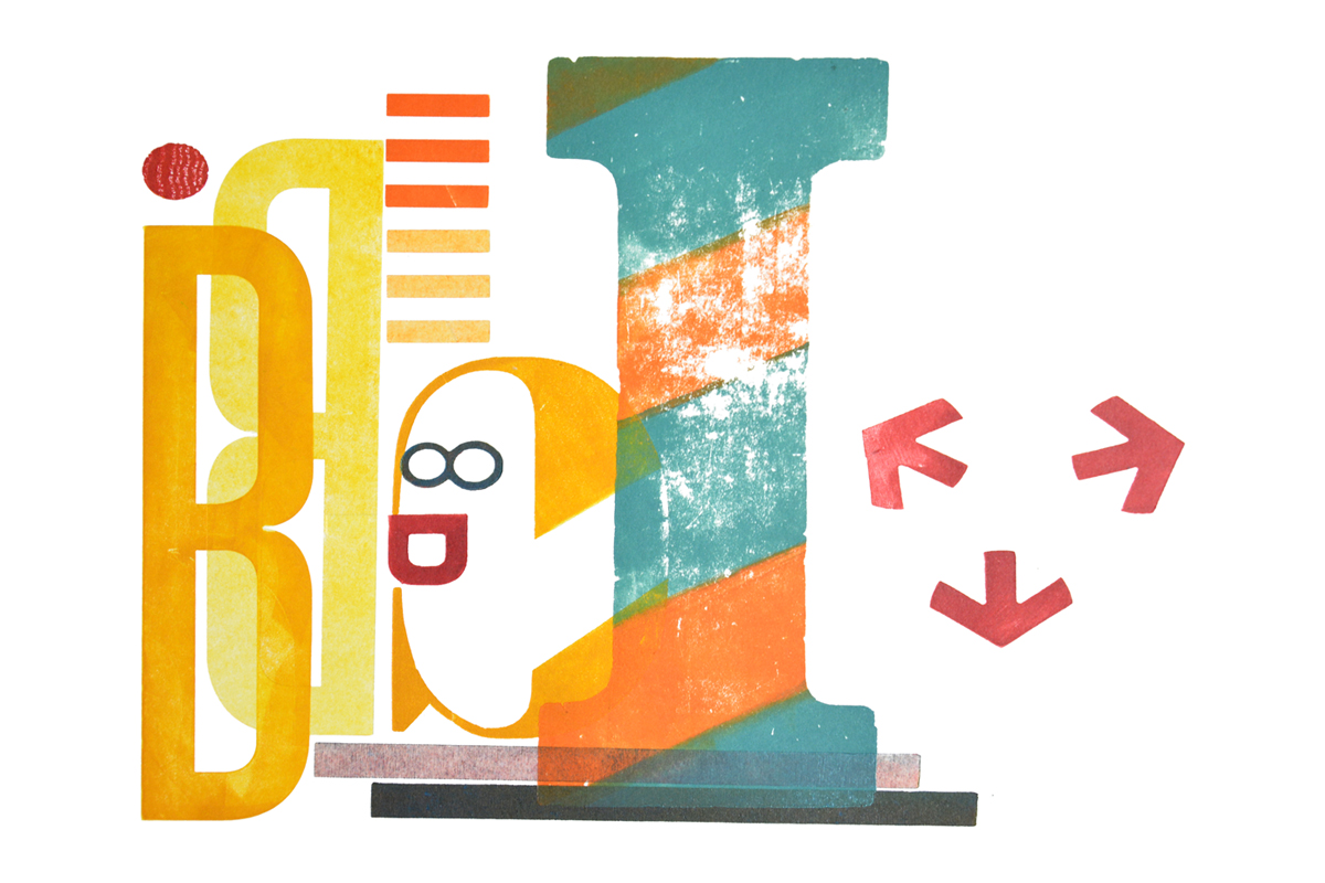
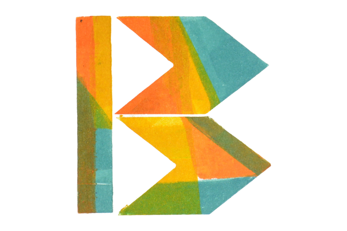
Click on the image above to cycle through 10 of the finished druksels from the workshop.
LEAD GRAFFITI HAS CONDUCTED a number of workshops with the Delaware College of Art & Design, most often working with professor John Breakey, whose design class has recently taken our H.N. Werkman Creative Letterpress workshop.
John wanted to carry the letterpress experience another step for the 9 students by producing a series of display posters highlighting the DCAD student's "druksels." The posters would include a short student write-up about Werkman which would be printed from photopolymer plates.
We started with 5 of the 9 students at 9:30am with no idea of where we were going. The only given was that the end result would essentially be a series of posters, each containing a Werkman visual the students had produced in the first workshop (see DCAD H.N. Werkman workshop : Part one below for some in-progress shots) somehow combined with the small block of text.
A shot from the hip
With the group sitting in the studio under our display wall of 20 of our Tour de Lead Graffiti broadsides, John talked about how he liked this project because even with all of the individual qualities the broadsides had, there was still a strong sense of "edition." That edition idea focused the rest of the discussion. We tried to encourage a somewhat Lead Graffiti-style experience by urging students to jump in without a lot of planning and without any sketching, or as we say, "designing from the hip."
We opted to print on our Vandercook Universal III as it could accommodate an 18" x 24" sheet and give the posters some scale for a little drama. A number of the students had essentially filled their 11" x 11.5" Werkman prints from the 1st workshop to the edge. Deciding that the posters would be vertical, we suggested generally working with the text and images at angles to counter the normal default tendency of centering the image and text. Ray did a bit of a design talk, encouraging the students to develop a process that invited noticeable design decisions, making a point that working on white paper and centering visual elements aren't typically memorable design decisions.
Ray urged the students to consider making the type block intrude into the print in some way to create a visual connection between the two elements. It would also nicely refer back to Werkman's original druksels, which were often slightly askew with a strong sense of having been hand done.
We needed a stock that would allow us to pull about 50 sheets that would help create some continuity while still supporting individuality. Luckily we had stacks of colored Canson Mi Tientes paper we purchased a couple of years ago in ten-sheet packages of a whole rainbow of colors to have around, just in case.
Today turned out to be the case. We spread all the Canson on the table. The students could select the colors that would work best with each druksel. With each of the 9 students doing 3 or 4 posters apiece, they would gain a lot of variety of color, both from the original prints and the Canson paper, while also creating a collective identity. Mounted in a display they would visually "hang" together.
DCAD H.N. Werkman workshop : Part one
Here are a few pictures of the students working on the original druksels from the original February 27 workshop with the students from DCAD.

Great care is taken in placing the inked elements and in removing them after printing to avoid smears and "hesitation" marks.

Reacting to the colors and placement of previous elements is a good way to approach this type of design experimentation.

This ode to the letter N fills the page with color and texture.

DCAD H.N. Werkman workshop : Part two
Here are 10 production photos from the day (on 4/24/18) spent working on the display posters with the students from DCAD two months after their original druksel images were printed.

above. Choosing a color to highlight the druksel.

Looking for a way to notch the original image to connect the type and emphasize the Werkman connection.

Positioning the photopolymer plate so it will be in the desired place once it adheres to the base.

Loading the paper carefully ensures accurate positioning of the text block when printing the sheet.
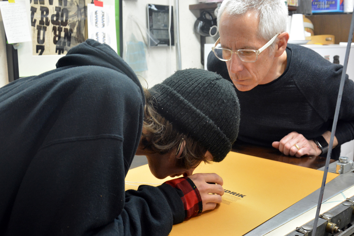
Using a 10x loupe to look at the print quality and ink density.

Measuring to trim the druksel to expose the type.

Measure twice and cut once to expose the type.

Some people took the notching a couple of steps farther. The addition of the offcut can often add extra visual interest.

Trimming the Canson paper to size gave everyone some colorful strips to use as additional design elements to help connect their set of posters.
We will post some of the final posters when the students have finished them.
One final piece for good measure

Printing a keepsake for everyone, which you can see at the very bottom.
At the end of the day, John Breakey wondered out loud if there wasn't something else that could be done easily. All of the photopolymer type blocks were there and of course we love spontaneity at Lead Graffitti. At fairly unconsidered angles, we placed as many of the blocks on the base as we could print at one time. Everyone grabbed a new sheet of Canson and we printed the text blocks, repeating the process a second time for the remaining 3 blocks of type. A bit of 72 point Euro added DCAD. Hand setting the date a little smaller and centering it over a Lead Graffiti logo copperplate made for a 3rd run, and THEN we called it quits for the day.

This is another example of how letterpress will sometimes allow you to work very spontaneously to produce an interesting physical artifact. We got everyone to sign it.
This ended up being very nice spontaneous day in the studio with a great group.