Heere bigynneth Chaucers Tale of Thopas

THE PROJECT : This year The William Morris Society celebrates 125 years since the publication of the Kelmscott Chaucer, the crowning glory of William Morris’s book printing venture.

The society invited a variety of letterpress printers to participate in a collaborative project to highlight the various tales involved in Chaucer’s tales. We gladly agreed. Each printer got to choose tales they wanted to use as the basis to create a poster. The collective work will form of the basis of an exhibition that will be hosted by the Society and on their website.

We’ve had a metal cut of the knight image for a couple of years. You see it printed original size in the lower right of our poster below.

If you would like an Adobe Illustrator file of the image (16” x 11”), click here.

If you would like to see what the other contributions were, click here.

If you want a digital Illustrator copy of the Knight, click here to download it free of charge.

re IllustratorA key part of the Society’s celebrations will be a new interpretation of key extracts from the Kelmscott Chaucer, created by contemporary letterpress printers and artists. This work will form of the basis of an exhibition that will be hosted by the Society and on their website.

As a participant Lead Graffiti received a complete set of the pieces.

On our poster we wanted the type to have an aged feeling to it. We often handrail type to get it to have a more “painterly” feel. This time we worked backwards.

Using our Vandercook Universal III we would ink the type and then lift the inking rollers. Using the small bubble bubblewrap we would lay a sheet over the text (not the headlines) and apply a pretty fair amount of pressure over all of it. We would then lift the bubblewrap which would randomly remove ink giving it a mottled look with a nice sense of age.

You can see how our “aged” type looks below. Bubblewrap use #442.

Printed : September 2021

Client : The Kelmscott Society, London, UK

Size : 17.75” x 24”

Type : Satanic, Melior

Runs : 4 (& bubblewrap extractions)

Paper : ?

Press : Vandercook

Edition : 65

APHA calendar pages for 2022

Ray has a pretty solid reputation for the calendar pages he does for APHA, the American Printing History Association, for challenging basic assertions for what makes a good calendar. He is always looking for ways to violate any rules and looks for opportunities to turn the page into a more conceptual and creative project than any concern for making it calendar-useful.

After two years of the Covid pandemic and the opportunity for doing January and starting the year, Ray came up with the idea of starting it right.

Saturday, January 1 and then doing that until you get it right or at least by the end of the month.

Jill chose July. It is hard to not just do everything red and blue, which she did, but she took a slightly different view with the color tone and saturation. Working both with her playful form of calligraphy and the use of tissue paper to create texture she created a very playful, but subdued, quality to the piece.

Working both with handset metal type and photopolymer she found a nice balance between the playfulness and consumer needs for a calendar that can be useful.

Invoice for “Trump” metal type from 1978

In 2017 I helped Lindsay Schmittle, Gingerly Press / Pittsburgh, negotiate a sale with Henry Morris of Bird and Bull Press. Henry, who was 87 at the time, was selling everything in his letterpress shop. Lindsay wanted his variable speed C & P press and his complete inventory of metal typefaces. One of those typefaces was Trump Medieval.

As it turned out, the Trump type (actually Trump Mediaeval) was too large for the type of letterpress work Lindsay preferred to do. As I already had a fairly complete run of the type, Lindsay traded some smaller sizes from our collection for all of the Trump (about 8 job cases).

She later came across the 1977 invoice for $310.30 for the 16pt Trump Regular, Italic, and a full set of accented characters.

Below you can see an excellent application of the accented types in our political postcards we were mailing to all U.S. Senators in 3-week intervals. In this instance, we were protesting the travel bans in the early part of Donald Trump’s tenure as President of the U.S. We took the quote from the Statue of Liberty and exchanged every opportunity with an accent character.

We think this is a wonderfully simple idea that dropped right into our world as letterpress printers.

card-indivisible-give-me-your-tired-your-poor.jpg

Bi-weekly meetings with first-year DCAD students / Fall 2020

First thing is for the students to watch our YouTube video introduction to Lead Graffiti.

The main thing we would like to talk about in these every-other-week talks is “WHAT WOULD A GOOD STUDENT DO? RIGHT HERE. RIGHT NOW.”

. . . Q U E S T I O N S O N E T H R U T H R E E

Please write a comment to this blog post and ask us 3 questions (you don’t have to have them in 1 comment). We need you to contribute to controlling the conversation. Two of them should flow from the YouTube video and our work at the end. The third should be a separate “I’m-a-DCAD-student and have a DCAD-student question.”

perforation-dots-w-variable-shadow-600w.jpg

Additionally, we would like you to answer a few questions just for yourself and have your answers with you when you get to the interactive gathering with Lead Graffiti. Don’t write the answers in your comment to this blog post.

. . . Q U E S T I O N S F O U R T H R U S E V E N

Keep in mind the guy who is writing this, taught at 2 different universities and for 3 decades was head of the Visual Communications program at the University of Delaware. I had hundreds of students, many of whom have gone on to distinguished careers in the field. I’ve attended a hundred portfolio reviews, which included graduates from other schools with serious reputations. I’ve had an enormous library of design books. I gave close to 800 books and magazines to the DCAD library, most of which I have scoured for years. You can’t see into my head, but figure that if I talked with you for an hour and you showed me 10 of your best pieces of work, I would get an impression of how good you are.

. . . Q U E S T I O N 4 : SO, HOW GOOD DO YOU THINK I WOULD THINK YOU ARE?

Considering approximately 50 students in DCAD’s 1st-year class in 2020, where would I rank you? Write down the number like this. “Your rank as a number” out of 50 (25 out of 50 would put you in the middle). HOW GOOD ARE YOU? The point is to get you to the top 5 AT LEAST. Maybe even top 3. After that it doesn’t matter.

. . . Q U E S T I O N 5 : HOW GOOD DO YOU THINK YOU ARE?

You’ve got to guess how good the other 1st-year students at DCAD this year, but where do you think you would rank yourself? Write down the number like this. “Your rank as a number” out of 50.

It would be interesting to take the average of everyone’s writing.

. . . Q U E S T I O N 6 : WHERE DO YOU WANT TO BE IN 5 YEARS?

You are going to be involved with DCAD for 2 years. At that point, some of you will go to another school to complete their undergraduate career. Some of you will go on to graduate school. After finishing DCAD, some of you will go directly to a job, hopefully doing the type of work or be supported by an art gallery in what you will study at DCAD. DESCRIBE WHERE THAT IS IN 50 WORDS OR LESS. Where geographically? Where professionally? What kind of people are there?

Not an assignment, but I think here are a couple of good things for you to think about doing.

In your answer to question #6 above, find the names of 10 people who are good at what you want to be in 5 years. Start to find out how they got there (profiles on LinkedIn and Facebook, Instagram (look way back and come forward). I’m a person that doesn’t believe much in the value of talent. I think we are all born with an amount of it and then you cannot get more of it. End of discussion. You have some talent, and you are stuck with it. The big question is, what can you do to strengthen it or make up for it.

. . . Q U E S T I O N 7 : HOW DO YOU GET BEYOND WHERE YOUR TALENT ALONE WILL TAKE YOU?

The answer is to know a bunch of answers to this question : WHAT WOULD A GOOD STUDENT DO? RIGHT HERE? RIGHT NOW?

We’d love to talk with any of you about this. Feel free to keep in touch. Show us your work. Ask a hundred more questions.

Histories of Newark : 1758 - 2008

We are still trying to rebuild this important Lead Graffiti story from our previous website. What follows in this blog entry is text from several pages in our old website’s blog. They are pretty disconnected.

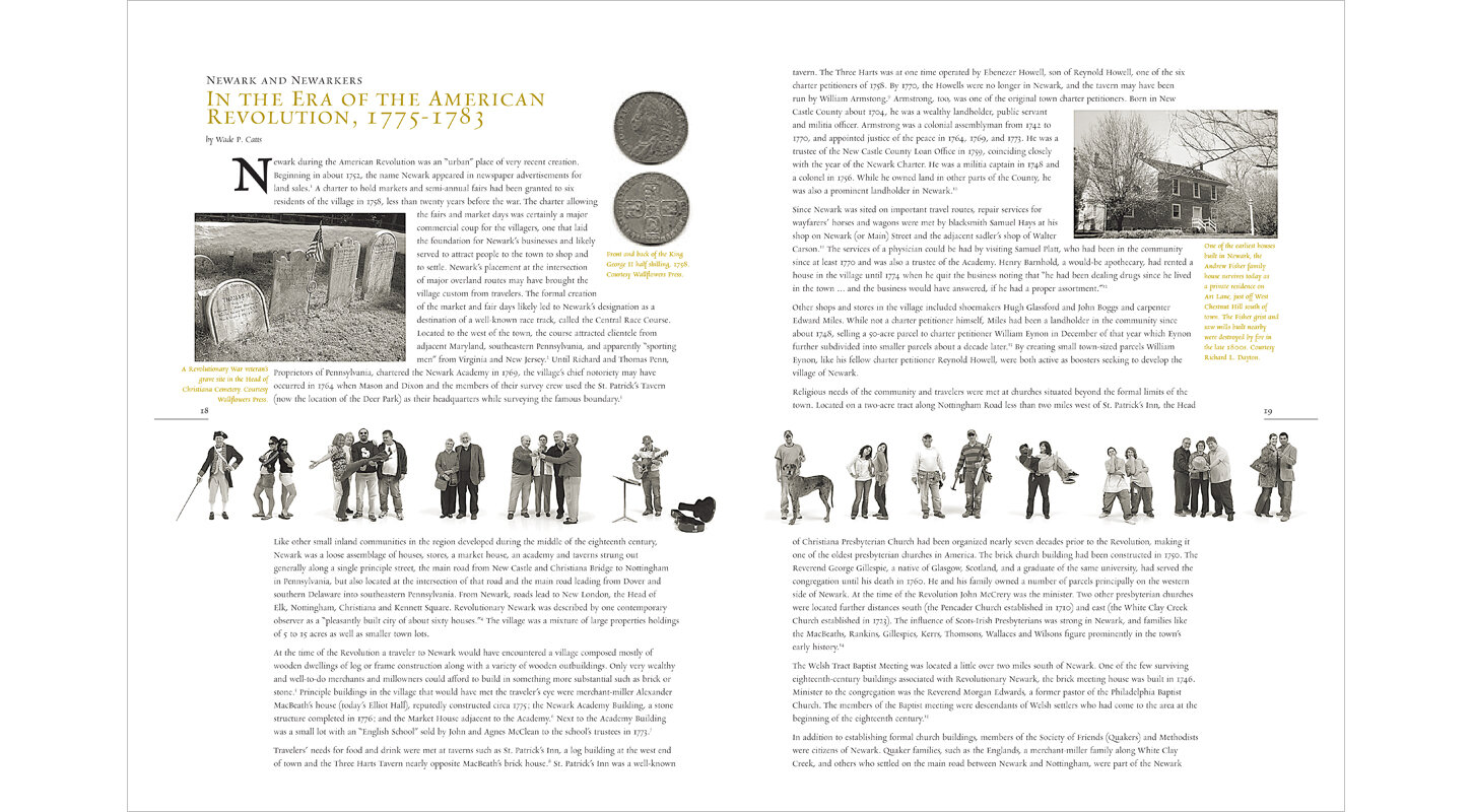
NOTE : The only books available are two deluxe, leather bound editions which are priced at $450. They have a 5/8” inlaid coin minted in 1758 with King George II, the signer of the Newark charter which was signed in 1758. Seriously, how cool of a find was that?

george-II-coin-front-back.jpg

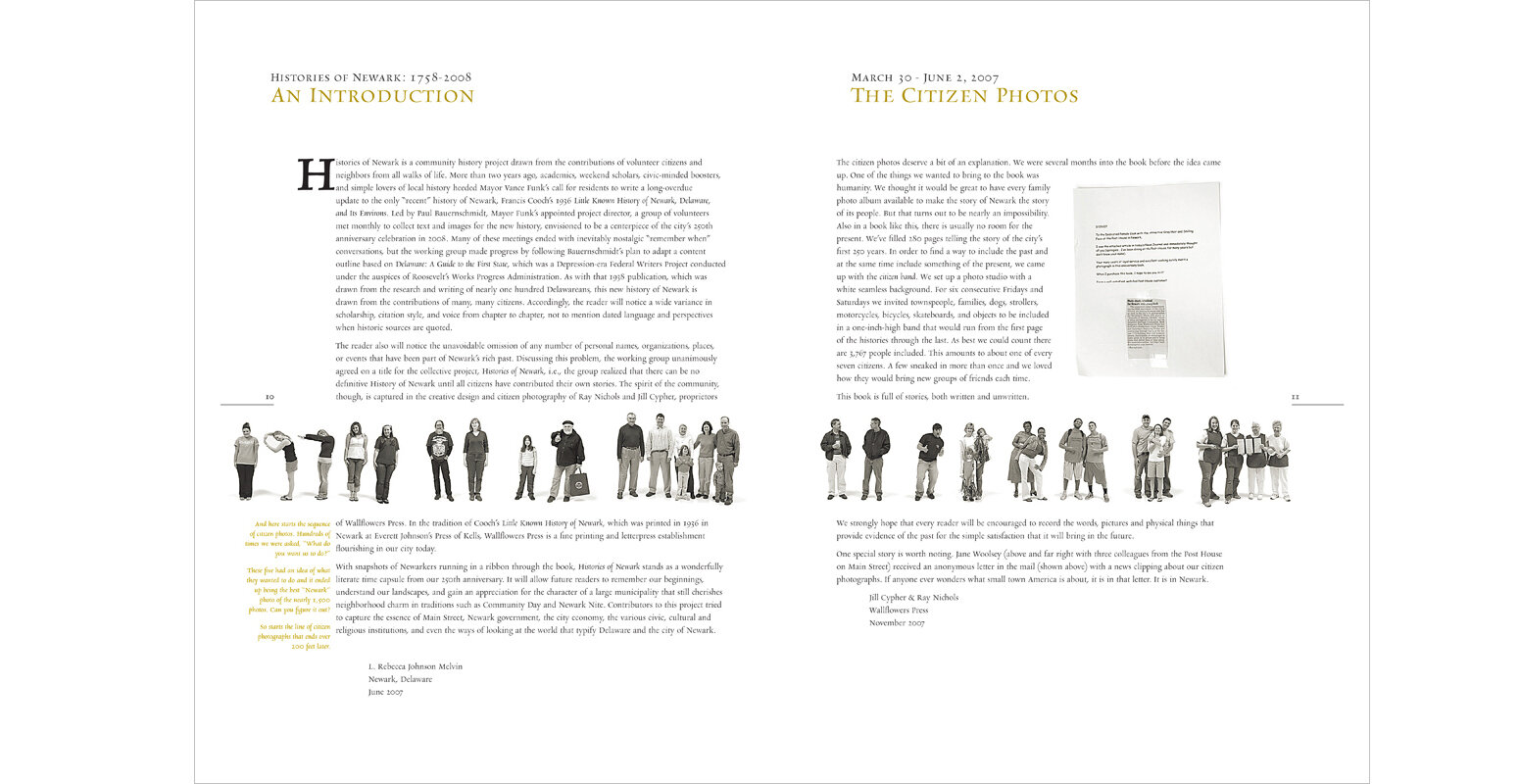
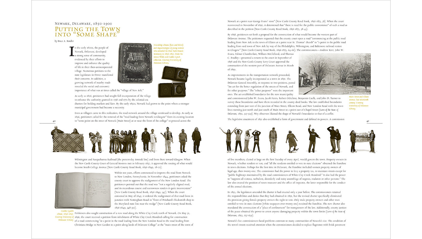
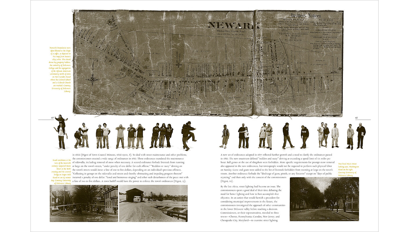
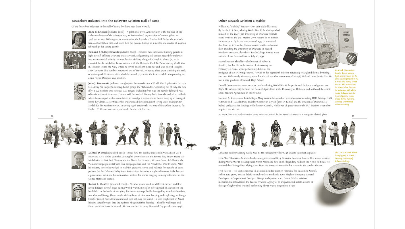
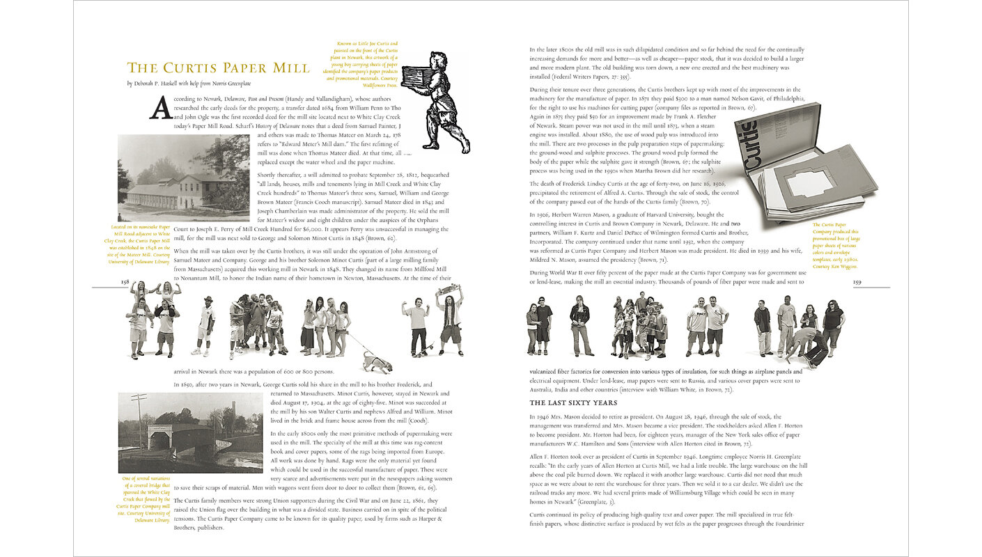
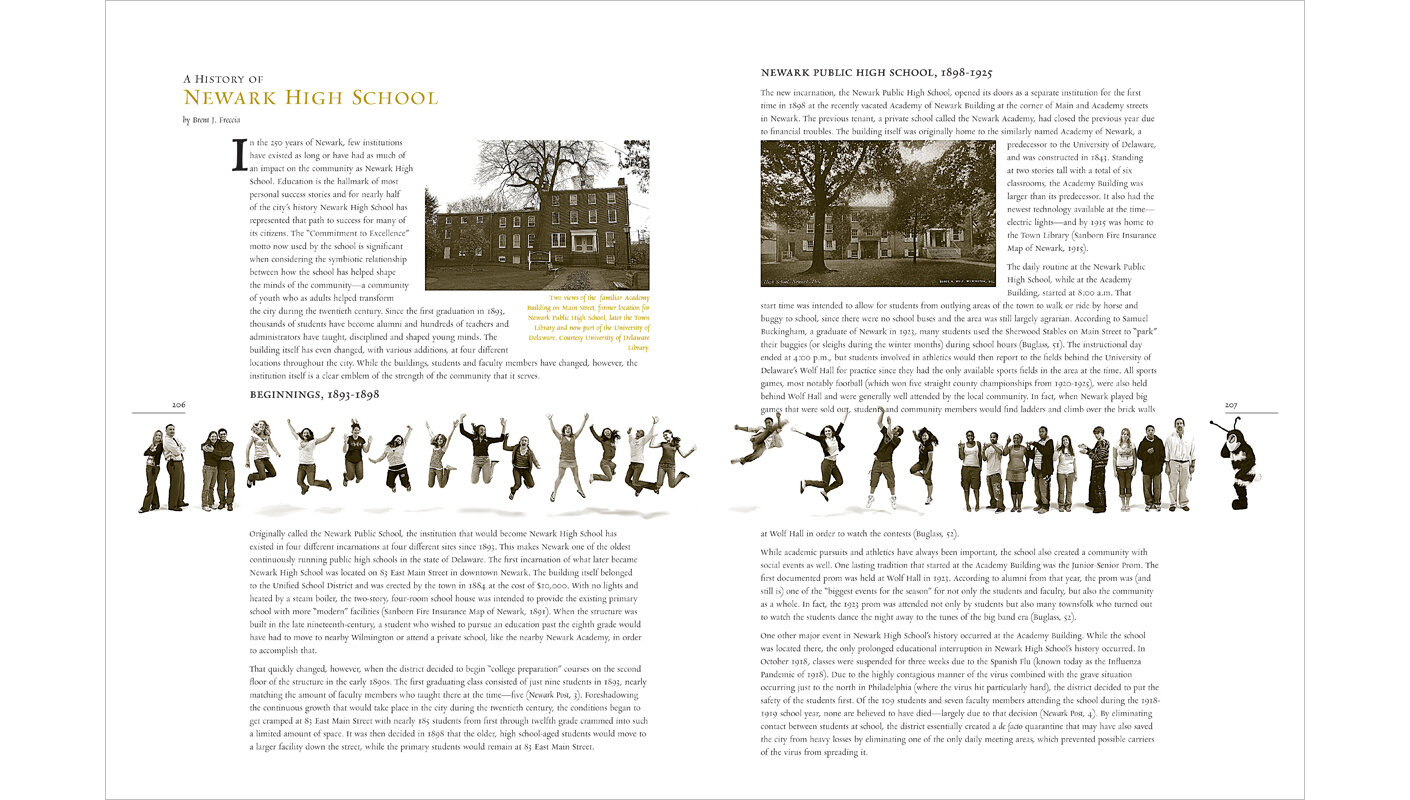
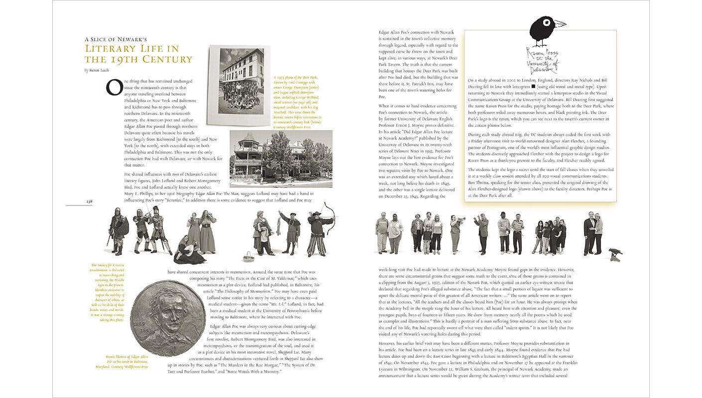
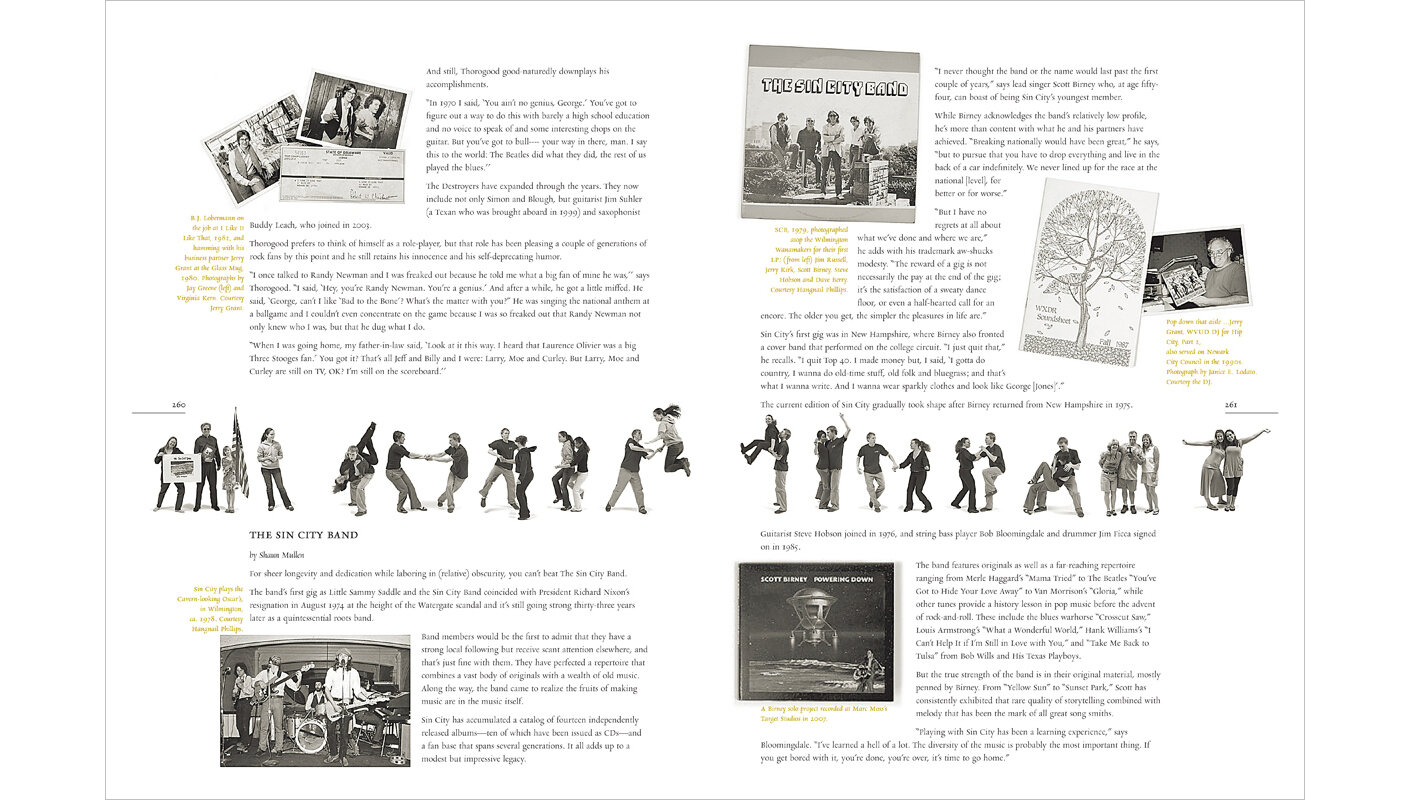
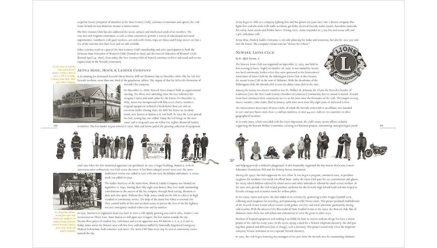
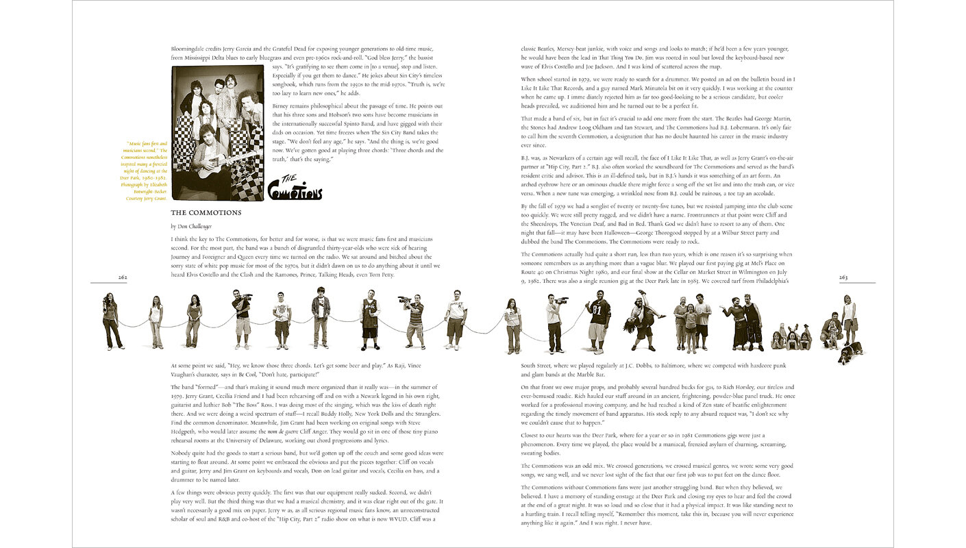
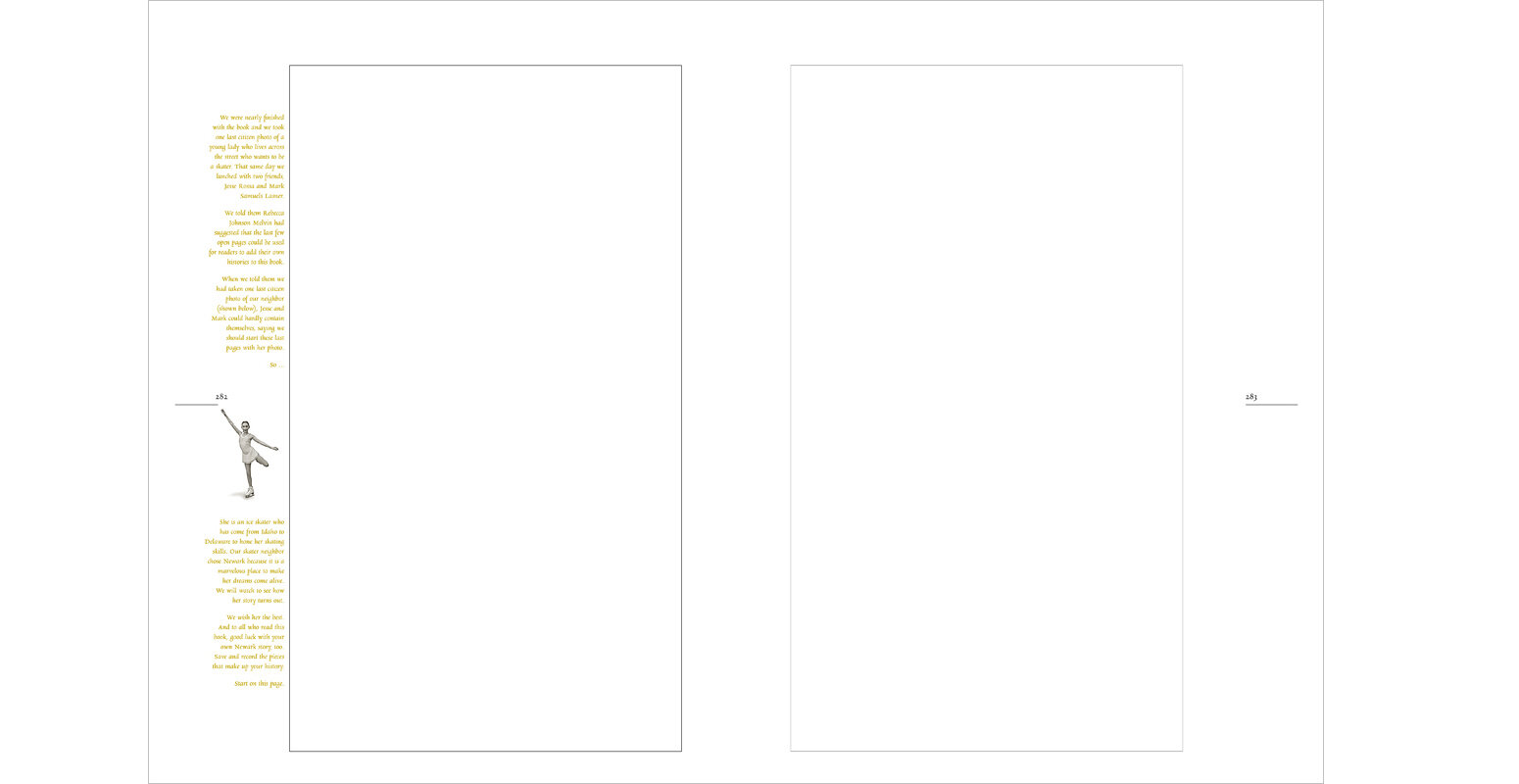
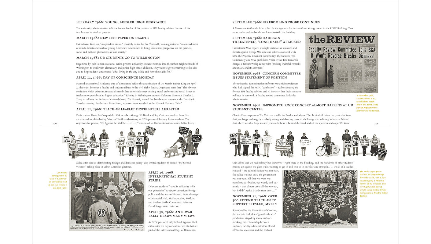
Below is a carousel of images of 20 spreads below will show you a nice range of the pages, the variety to spread layouts, citizen photographs of all kinds of groupings, and the general fun we had designing and photographing for this book. Just click an image to advance to the next one.

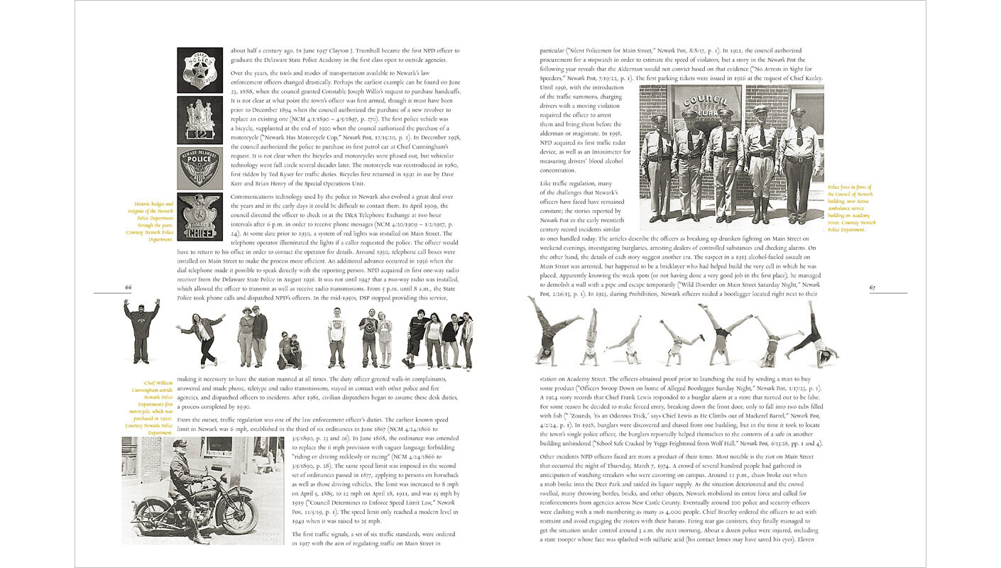
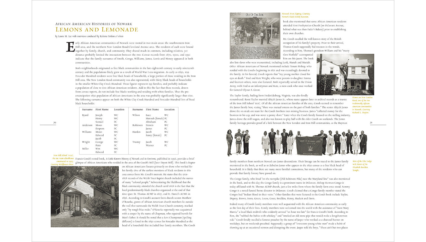
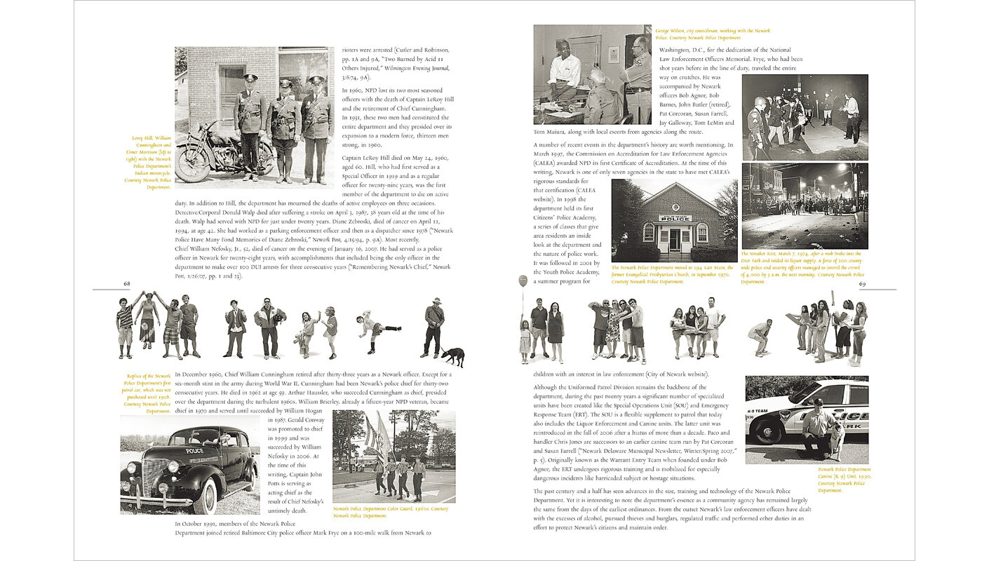
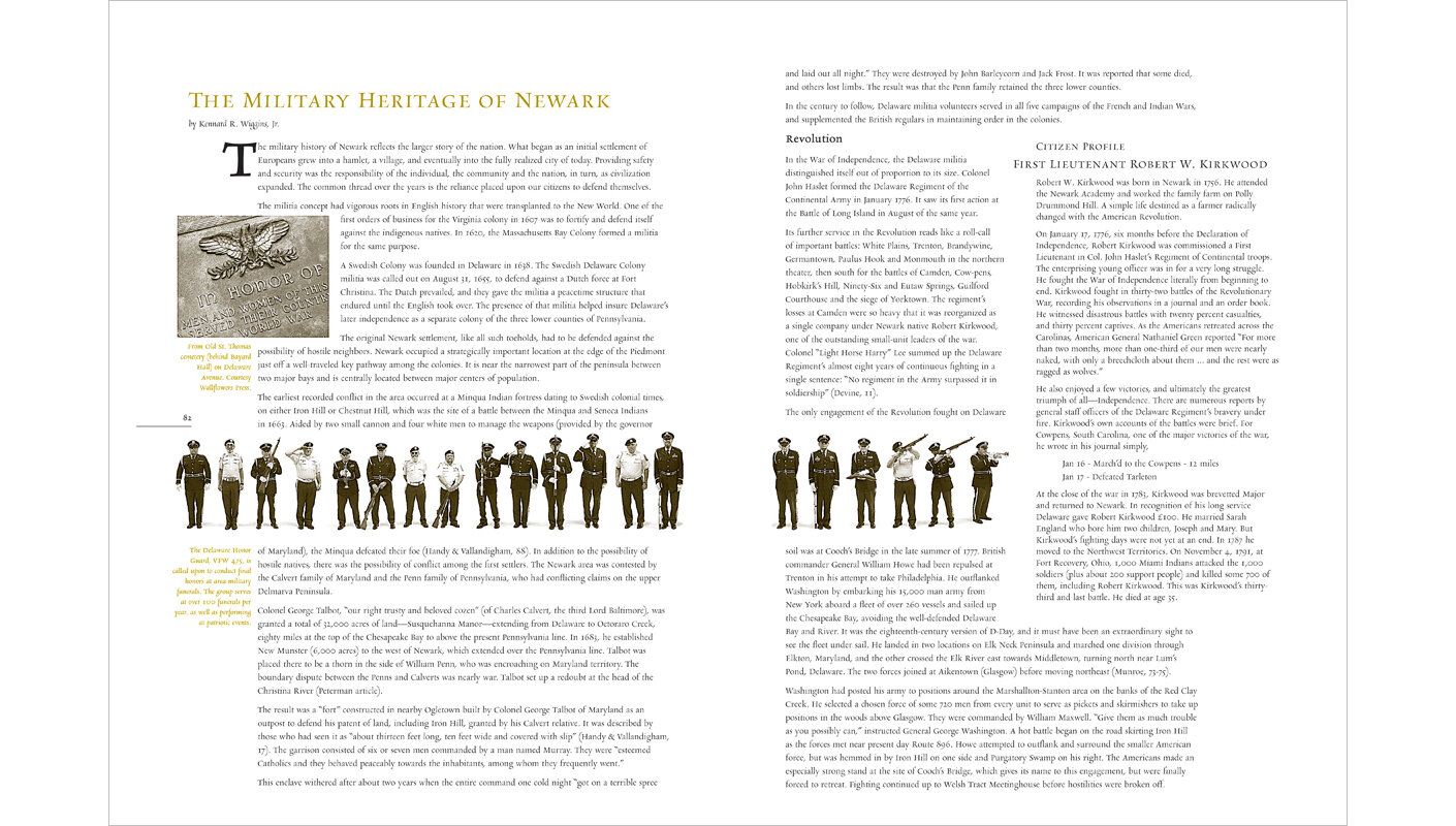
The design of the book includes a 1″ band that will run through the middle of every page of the book to include current citizens of Newark. A book on the history of the city doesn’t have room for the contemporary city and a lot of the old photos do not include much of the humanity that has gone into that history.

This citizen band was included to counter both of those problems.

While the effort in the citizen photography was far more than we anticipated the fun of doing it was also far beyond what we anticipated

Picture #1 of the CITIZEN BAND was such a good idea from the 5 women in the photo that we decided to make it the first one. Can you figure out why?. Photo #2 is Jill and I

After we had finished the citizen band here are some statistics.

  • Scheduled hours included in photoshoots : 98

  • Total number of citizen photos taken : 5,054

  • Total file size of originals (color .jpg images) : 6.86 gigabytes

  • Total number of retouched photos : 1,237

  • Total file size of retouched photos (black/white .tif images) : 2.79 gigabytes

  • Estimated hours spent retouching : 155

  • Total citizens included (some sneaked into multiple images which was OK with us) : 3,767.

The original name we were using for our studio was Wallflowers Press. After a bit we decided against it because anytime anyone Googled it they would be getting “press kits” for the band “Wallflowers.”

As Wallflowers Press we designed and produced a lot of the photography for the nearly 300 page book on the Histories of Newark: 1758-2008.

We got a nice write-up in the Wilmington News Journal. The bike riders featured are worth a bit of the story.

As the ‘citizen photos’ part of the project was just getting started we hadn’t had a lot of publicity or word-of-mouth advertising happening. We had gotten the Wilmington News Journal to send down a reporter and a photographer on Friday, April 30 (our first day of shooting). They came at 5:00.

And it was dead at the photoshoot when the News Journal got there.

Ray was standing outside trying to find anyone to come in and be in a photograph. All of a sudden a group of about 25 bicyclists were coming down the street and holding up traffic. They took up the complete width of Main Street. Ray walked out and tried to talk with them while they rode by trying to get them to come in to do a photo. Not much enthusiasm for it at that point.

About 20 minutes later and our photoshoot was still just as dead the group circled back down the street in front of the building we were were holding the photoshoot. This time Ray went right out into the middle of the street to force them to listen to his story. “Be in the photograph and we’ll promote your cause.”

So they came in. We think the article pays off the promotion promise. Their group is called “Critical Mass.”

We are headed into the final stretch with the Histories of Newark 1758-2008. Rebecca Johnson Melvin, Jill and I traveled to Ivyland, Pennsylvania, to visit Downey Hoster at Hoster Bindery to approve the foil stamping on the hardback covers, to get a personal tour of the facility, and to talk about final details with the binding and delivery of the book.

It was also our first chance to see the final folding of the book’s signatures and the nesting of the signatures. There are some details we wanted in the book to help give it some sense of being handmade. Two things we did were to print the book on two colors of paper—vanilla and white and to leave the front edge of the book un-trimmed.

The book is printed in eight-page signatures (sheets with four pages on one side and four on the other which are folded in half both ways to get the pages oriented correctly). There is one signature in vanilla with two signatures in white nested inside each other. That way the book has 8 pages of vanilla followed by 16 pages of white. We thought it would give the book some texture. The other thing we wanted was a rough fore edge (the edge away from the spine). There was no way to do the book with deckle-edged (rough) paper (we would have loved to do it in handmade paper but we wouldn’t have gotten the book for another 22 years and the cost would about the same as putting in a city subway system). Anyway that fore edge is left untrimmed and it looked exactly like we had envisioned it. Everything we’ve heard about Hoster Binder has been positive and after the visit we saw why. Top notch equipment, personnel, vision, and the ability to see ways to contribute that the designer / printer can’t see.

One very nice element that Downey has added to our book is to round the spine. It seems like a small detail, but after having the architecture of the book explained from the point-of-view of the spine it is a must if you can have it.

The critical moment was Friday, December 7 at 6:00 pm. The Histories of Newark group along with the Mayor had an opening ceremony along with a booksigning. A lot of the authors come and we kind of wonder if anyone will want us to sign their copy of the book.

Another detail we wanted was to do a full dustjacket that folded over on the top and bottom. The jacket designed by Jill Cypher ended up being a perfect solution. We used a hand-drawn map of the city from 1820 and overlaid images of Newark people into the house shapes. It does a wonderful job of mimicking the inside look of the book.

We also got three sets of the unbound book with all of its parts. Wallflowers Press donated one to Special Collections at the University of Delaware Library, one to the Newark Historical Society, and we will keep one. Once we get into our new letterpress studio feel free to stop in and take a look. It is an interesting process and this book was done right from the very start.

Tell the Post waitress story.
Tell the Critical Mass story.